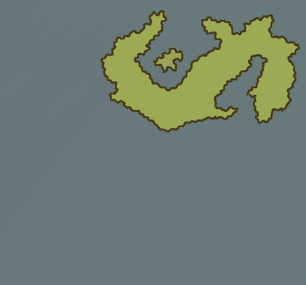
Posted September 22, 2016 Design 1: Design 2: Design 3: I just want to know what looks better and whether I should add more features. Eg: A compass rose, topography, etc. Share this post Link to post
Posted September 22, 2016 I think I'd need a bit more context behind what you're mapping and what time period you're going for to effectively choose, but right now I like the first design. Share this post Link to post
Posted September 22, 2016 Yeah, depends on what kind of map you're going for. What you put on it depends on what you're trying to show. Personally I like #3 because land and sea are clearly legible. Share this post Link to post
Posted September 22, 2016 Aesthetically I think #3 looks the best, but we need more information about the map and what you want from it in order to give better suggestions. Share this post Link to post
Posted September 22, 2016 I'd go with #3, since at first I thought that the land and ocean were switched, though if you want to go with a worn, treasure-map parchment look, I would say go with #1 and emphasize the ocean in some way to make it obvious and separate, such as making it darker, adding wave marks, or leaving it blank of features. I also think topography is a good idea to add, since the whole point of a map is to show the lay of the land and its biomes; compasses are also helpful since not all mapmakers have north at the top, though it's generally assumed that up = north when it's not specified. If you have settlements you can also draw small clusters of buildings in places, or simply designate them with symbols (similar to how Atlases use stars for state capitals). For a more mythical look you could add a decorative border and creatures rearing up in some places, kind of like Magistream's world map; or if you just want a bare-bones technical map, you could just color-code the regions and add symbols so that people know about the territories and what's in them at a glance. Also, rivers and lakes; it's surprising how lively the land looks with a few bodies of water! (Also how often I forget to add those in...) Just some suggestions based upon what I think you're doing. Share this post Link to post
Posted September 23, 2016 Hey guys, thanks for all the replies. This is actually the first time I've ever attempted to make a map. But yeah your input is greatly accepted. From what I can tell. Design 1 is the most preferred Design 1 Doesn't have enough detail to differentiate the oceans and seas from land. Design 2 is fairly safe to say the least appealing to all Design 3 is "Okay" with more work needed on various aspects. All round the maps need more geographical details. (topography, settlements, etc) All round the maps need more decorative features. (Borders, variant colouration, a compass, etc) So thanks again Share this post Link to post
Posted September 23, 2016 The first one is appealing if you're going for an "old" effect. What I would suggest is to make the water darker shade of that brownish color to really define that it's the water and not more land. Now, if you're going for an "old, yet preserved map" or "new map" kind of deal, the 3rd one is your choice. The center one is too flat and it looks unfinished. And that's my take on it. Sorry I was a bit late. ^^ Share this post Link to post
Recommended Posts