Posted July 9, 2015 (edited) When you disturb a Xenowyrm's sleep Edited July 10, 2015 by Zen_Cross Share this post Link to post
Posted July 9, 2015 oh your ladies are so beautiful <3333 how long have you been drawing? these are all so stellar ; u ; pfft omg that xenowyrm though oh no pls keep showing us more art! seeing your wips and the finished thing is amazing omg Share this post Link to post
Posted July 10, 2015 (edited) @Lady_Lunevis: Thanks, been drawing since high school but stopped for 2 years and begun drawing again in my 3rd year in university. I'm actually still unsatisfied with my drawings so I still want to beyond what I have now. Done, I removed the background since it took too long to even make the character: Edited July 10, 2015 by Zen_Cross Share this post Link to post
Posted July 11, 2015 Oh wow! That's gorgeous. Thank you very much for the second drawing in addition to the original. Very nice ^^ Share this post Link to post
Posted July 11, 2015 @XDragon52: It's all thanks for the dragon eggs since I really liked what I got from you and Selina's Share this post Link to post
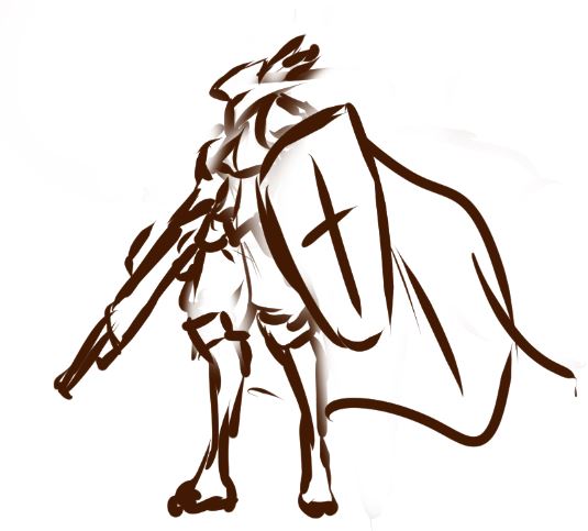
Posted July 14, 2015 Very interesting,good luck with your work! Thanks, it takes an iron will to continue after many failures. I've met many projects that failed before like indie groups for game making with me hired as an artist. Hope my friend does not get tired of his story and give up though. Work in Progress for a commission: Share this post Link to post
Posted July 14, 2015 Your stuff is always awesome, can't wait to see what other things you have waiting in the wings Share this post Link to post
Posted July 15, 2015 I really appreciate your lines and line weights, namely how they taper out beautifully in all the right spots. Personally, it's something I've been having a lot of trouble with. Is there a way to go about it (e.g. 2pt brush, a steady hand, and a lot of patience), or is the line (and line weight) creation and placement just a factor of experience? Share this post Link to post
Posted July 15, 2015 I really appreciate your lines and line weights, namely how they taper out beautifully in all the right spots. Personally, it's something I've been having a lot of trouble with. Is there a way to go about it (e.g. 2pt brush, a steady hand, and a lot of patience), or is the line (and line weight) creation and placement just a factor of experience? You gotta experiment, I myself am still looking for the right formula for that 'ideal' style. But at the same time I am getting better at other things. Done: Share this post Link to post
Posted July 15, 2015 You gotta experiment, I myself am still looking for the right formula for that 'ideal' style. But at the same time I am getting better at other things. 'course, you can argue that the 'ideal' style doesn't really exist. Just 'different' styles, some with better reception than others. Though, there is definitely a technique when it comes to manipulating pen pressure for it to do what you want, if that's what you mean. ;p Are you accepting critique on your shading? I have a few points to share but I'll let them be if I'm not welcome to do so. Share this post Link to post
Posted July 15, 2015 Are you accepting critique on your shading? I have a few points to share but I'll let them be if I'm not welcome to do so. Go right ahead, although my artist friends already bombarded me with what I can already it's interesting how others see it as. Share this post Link to post
Posted July 16, 2015 Got permission to post the full picture from the commissioner. Share this post Link to post
Posted July 16, 2015 (edited) Whoever asked for the pouncing pillow, I made one now while working in progress with mermaid. Edited July 19, 2015 by Zen_Cross Share this post Link to post
Posted July 16, 2015 (edited) I've found that the shading for most of the clothes you've done have a glossy sheen to them -- the bright highlights and the soft shadows imply that they are made of shiny rubber. I'm not sure if it's intentional, and it took me a while to formulate a reply presciently because I wasn't sure (most of your examples of female clothing here cling tightly to the body anyway). Nevertheless, material studies (drawing spheres of different stuffs) are intensely useful for learning to paint, I find. I like to compare, contrast, and paint the textures showcased on rendering sites like Maxwell Render from time to time as exercises. Your hair, though, looks cel-shaded (but frankly it looks awesome), but the style clashes with the soft shading of the clothing and the rest of the body. You can go the other direction in your style by making it all consistent (either all cel-shaded, or all soft-painted). This part is more of a personal style opinion rather than a critique: be more liberal with your shadows, be more sparse with your highlights, and keep in mind your light source. Play with more interesting light directions. I take it that you've taken figure drawing of some sort before -- use shading as a tool to define form, rather than letting the lines dictate where the shading would be. (I guess I was just expecting muscle definition on yugioh guy's arm when writing that last point. ) I wouldn't be surprised if what I've said has probably been said before by your artist friends already. Edited July 16, 2015 by TehUltimateMage Share this post Link to post
Posted July 17, 2015 I've found that the shading for most of the clothes you've done have a glossy sheen to them -- the bright highlights and the soft shadows imply that they are made of shiny rubber. I'm not sure if it's intentional, and it took me a while to formulate a reply presciently because I wasn't sure (most of your examples of female clothing here cling tightly to the body anyway). Nevertheless, material studies (drawing spheres of different stuffs) are intensely useful for learning to paint, I find. I like to compare, contrast, and paint the textures showcased on rendering sites like Maxwell Render from time to time as exercises. Your hair, though, looks cel-shaded (but frankly it looks awesome), but the style clashes with the soft shading of the clothing and the rest of the body. You can go the other direction in your style by making it all consistent (either all cel-shaded, or all soft-painted). This part is more of a personal style opinion rather than a critique: be more liberal with your shadows, be more sparse with your highlights, and keep in mind your light source. Play with more interesting light directions. I take it that you've taken figure drawing of some sort before -- use shading as a tool to define form, rather than letting the lines dictate where the shading would be. (I guess I was just expecting muscle definition on yugioh guy's arm when writing that last point. ) I wouldn't be surprised if what I've said has probably been said before by your artist friends already. That's quite an interesting view you have about the style I have right now. But yes, everything was intentional with making a shiny spandex-like fabric and shiny metallic parts and the hair. My pursuit of 'ideal' style is between the styles you mentioned or it might be another style by itself. My real style is actually less anime style than the ones I posted thus the cartoon celshade. Share this post Link to post
Posted July 19, 2015 oh dang that is a gorgeous mermaid <333 can't wait to see it when it's finished!! Share this post Link to post
Posted July 19, 2015 Work in Progress, sadly I can't show final versions of commssions of this type: Share this post Link to post
Posted July 20, 2015 Work in Progress, doing some corrections before continuing. Share this post Link to post
Posted July 21, 2015 Mmmf that mermaid is just gorgeous! The shading and colors and glowy thing asdlkfjsaf TTuTT Share this post Link to post
Recommended Posts