Posted January 4, 2012 (edited) Wow, I love the shading on all of them. The horse and gold are the most amazing. I just wish that the golds would have kept the original pose, at least for the female, I really loved it. I'll also miss the glow around the gold. Can't see much difference in the sunset, other then a 3rd horn. Edited January 4, 2012 by Lady_DragonRider Share this post Link to post
Posted January 4, 2012 As I said the new golds are just beautiful, really royal looking! =) Kudos to the spriter! I'm not very fond of the reshaded sprites, however, though I understand why they were changed. The male sunset seems a bit unclear now, it's shining too much for me.(as did the female) The horse's anatomical changes are great, but now the sprite looks a little spooky to me, I don't know. That's just my opinion though. I've also looked at my old drawings/paintings and was like 'oh god, what is that? it's hurting my eyes!?! :/' and I think it's clear to everyone, that the longer you're doing something, the more you will progress. That said I can understand the artists' desire to "repair" the old, but I don't really see it as necessary. Most users get attached to the sprites, we love what you've done. I can't think of any other game where things are being changed/replaced. Heck, I still prefer the old Valentine sprite and I don't care that it's going to lean or fall. Her little details made it for me. (the little puff of smoke, the awesome wings:)) I will never like the new as much as I liked the old. So yes, why not leave the shininess to the new stripes (some of them also yours as I've seen), why not let it be diversity.. or at least that's what I'm for. Share this post Link to post
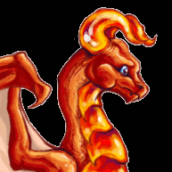
Posted January 4, 2012 I mentioned before that I do like the new gold sprites, but they're just barely too different from the originals to really be the same dragon. Again, my three big issues: New sprite is missing the belly scales Original sprite had unique black-and-white eyes, new sprite has boring, overcommon "shiny " eyes New sprite looks snide and cold, whereas the older sprite had a more neutral expression If those three issues could be addressed, then I would have no problem at all with the new golds. I have relatively few criticisms for the other sprites, all of which have already been mentioned. Share this post Link to post
Posted January 4, 2012 I like the new sprites. I'll sort of miss the gold hatchling, but I never really liked the old adult gold sprite very much, and I think the new ones are very impressive. The sunset female strikes me as slightly less bug-eyed than the older sprite -- I like the darker shading on her, and the more nuanced shading on the sunset males. Share this post Link to post
Posted January 4, 2012 I find the new Golds much more apealling than the old ones. They're beautiful! Share this post Link to post
Posted January 4, 2012 I love all the new sprites, the detail on the shading for the sunset/sunrises look wonderful. the edit to the the horse makes the mane look so much more wild and vibrant. and the golds, the amazing edit to the golds! they look so much more shiny and metallic, the poses, the colors, the dinomorphism, everything is substantially better. The old gold looked, when compared to any of the other sprites, cartoony and over simplified. The old colors where flat and it wasn't that the old gold "shined" but more like it was colored outside the lines. These are all amazing and wonderful, wonderful job to all the new sprites. I love them all and am so glad that this took place! Share this post Link to post
Posted January 4, 2012 The gold sprites are awesome. I have fully agreed on that since the day they were changed. Kudos to the artists for doing such an awesome job. As for the others, TBH, I wouldn't have even been able to tell the difference if I hadn't seen their old and new sprites side by side in the first post. It is only after minutely examining them for a few moments, I've been reach the conclusion that the change is in the shading and the lighting. However now that my eyes are getting used to it, it looks more shiny and better. Good job again. Share this post Link to post
Posted January 4, 2012 Thank you to the spriters for these updates. When I first saw the golds, I didn't like them so much, but they grew on me immediately on second viewing. Horse dragon is so much better (to me) -- I'm glad that the corrections that came in the red and white horse carried over into the normal breed. I like the sunsets because of the greatly improved shading. I really can't see the difference on the sunrise, but I guess that means that I'm in favor of the change. Share this post Link to post
Posted January 4, 2012 (edited) For me, I do not really like the new Golds as they look to much like the Harvest Dragons. They do not seem to 'glow' the same way as the old ones did, to me they just look mustard yellow. Which is kind of dull.I was very fond of the old sprite. The new sprite for the Horse Dragon, I wish they would have made that the male and left the old one for the female. Or visa versa, but have one sprite for one gender and leave the old sprite for the other gender. I do like it quite a bit, much better than I like the new Gold sprite. The new Sunset sprite is very nice. I think the changes are subtle enough, but do make a marked difference. The new Sunrise sprite is so subtle, that I can barely tell. I like this one, too. I hope they leave all the other older dragons the way they are. Or if they do change them, then do as they did with the pinks, let us keep our older sprites. Thus making it more fun to collect older dragons in a new form. Unless the original artists do not want their older works to be used. But if the original artists do not mind, let us keep the older sprites as retired. PLEASE do not change the Hollys, they are such an iconic dragon unto themselves. Edited January 4, 2012 by SockPuppet Strangler Share this post Link to post
Posted January 4, 2012 The old golds were kinda 'meh' to be, which is why I didn't care if I didn't have any; they looked like paper cut-outs or something. But now... Now I want some! Each to their own, I guess. Share this post Link to post
Posted January 4, 2012 (edited) Why are the dragons appearing first, though? It's annoying that I have to scroll to get to my eggs, I sorted them eggs first for a reason. Edited January 4, 2012 by Crikey! Share this post Link to post
Posted January 4, 2012 To be honest, I just got a gold and I was rather disappointed to find out the sprite had changed... there was something... special about the old one that I loved. Oh well. It's a pretty sprite Share this post Link to post
Posted January 4, 2012 (edited) Looks like my all time favorite dragon is under going a revamp...the male sunset. That is a bit of a shame as he has lost his brilliant colouring and now looks a little washed out, to me anyway. On the wings in particular. I thought he was perfect to begin with. Ah well, it is only my opinion, I am sure many others love the change. Still loving the new golds and the horse looks better too. Edited January 4, 2012 by Dubious Share this post Link to post
Posted January 4, 2012 The new sprite for the Horse Dragon, I wish they would have made that the male and left the old one for the female. Or visa versa, but have one sprite for one gender and leave the old sprite for the other gender. I do like it quite a bit, much better than I like the new Gold sprite. [....] I hope they leave all the other older dragons the way they are. Or if they do change them, then do as they did with the pinks, let us keep our older sprites. Thus making it more fun to collect older dragons in a new form. Unless the original artists do not want their older works to be used. But if the original artists do not mind, let us keep the older sprites as retired. PLEASE do not change the Hollys, they are such an iconic dragon unto themselves. Agreed. I like the new sprites, but I'd have rather kept my old golds... and I think having a little dimorphism for the horses would have been nice, even if it was as subtle as the new vs old sprite. I think it's a little sad that the old sprites are gone. A little piece of history banished to the wiki and saved precariously on various hard drives but not readily viewable. Share this post Link to post
Posted January 4, 2012 (edited) To be honest, I just got a gold and I was rather disappointed to find out the sprite had changed... there was something... special about the old one that I loved. Oh well. It's a pretty sprite To me, it's the lack of a glow. If they still glowed, they'd be absolutely perfect to me. Like this: See how standout the glow makes them? Portal skin used for emphasis. (Someone in the know PM me if I wasn't supposed to do that? I don't want to get in trouble. I'll yank it and delete the image if I'm told to.) I still like them better now. I actually want some. Heck, I want to freeze one or two! Before, I was happy with my one gold and didn't give two bits whether I ever got another or not. Now I care. Now, I want MOAR. And to be honest, before their dimorphism, I didn't even bother to memorize my Gold's gender. I think she needs a name change now. I neglected to take into account that it was a girl. Named her like a guy. I thought she was a guy. I cared that much what she was. Also, I hope this mixes up the mates! I now think GoldXBlack is ugly and GoldXWhite is meh. Midas Dorkface now looks less Dorkfaceish, as well. I'm fine with these, though. I can see oldXHarvest becoming popular, among other new, beautiful combos. I'll get used to Midas's new sprite as well. It'll just take time, is all. As for the other changes, I like the Horse and the Sunsets, but am pretty neutral on the sunrise. It doesn't look that different to me. Edited January 4, 2012 by SockPuppet Strangler Share this post Link to post
Posted January 4, 2012 Yes, these golden outlines would really make a huge difference! I really liked the old gold sprites, but I'm ok with these, too. The horses look brilliant, and the male sunsong also looks good. Share this post Link to post
Posted January 4, 2012 I love the new Gold sprites. Now it is really golden not just a kind of yellow. The new eggs looks much more golden now but they can easily been mistaken as a gold tinsel now. And I also like the new Horse sprite though I have to admit I would love to see it in it festive colours again. And for the Suns: I didn't even realise they changed. All of this, actually. Share this post Link to post
Posted January 4, 2012 (edited) To me, it's the lack of a glow. If they still glowed, they'd be absolutely perfect to me. Like this: See how standout the glow makes them? Portal skin used for emphasis. (Someone in the know PM me if I wasn't supposed to do that? I don't want to get in trouble. I'll yank it and delete the image if I'm told to.) I still like them better now. I actually want some. Heck, I want to freeze one or two! Before, I was happy with my one gold and didn't give two bits whether I ever got another or not. Now I care. Now, I want MOAR. And to be honest, before their dimorphism, I didn't even bother to memorize my Gold's gender. I think she needs a name change now. I neglected to take into account that it was a girl. Named her like a guy. I thought she was a guy. I cared that much what she was. Also, I hope this mixes up the mates! I now think GoldXBlack is ugly and GoldXWhite is meh. Midas Dorkface now looks less Dorkfaceish, as well. I'm fine with these, though. I can see oldXHarvest becoming popular, among other new, beautiful combos. I'll get used to Midas's new sprite as well. It'll just take time, is all. As for the other changes, I like the Horse and the Sunsets, but am pretty neutral on the sunrise. It doesn't look that different to me. ...You know I never realized that. The glow does look better. o-o Edited January 4, 2012 by SockPuppet Strangler Share this post Link to post
Posted January 4, 2012 (edited) ~Spam removed~ Edited January 5, 2012 by SockPuppet Strangler Share this post Link to post
Posted January 5, 2012 To me, it's the lack of a glow. If they still glowed, they'd be absolutely perfect to me. Like this: Yes, same here ^^ And on the normal skin it looks so neat.. Nakase if you're reading this, please consider adding a glow to the sprite. Share this post Link to post
Posted January 5, 2012 Wow, they really do look better with the glow! That would be amazing if that could be added back to them. ^__^ Share this post Link to post
Posted January 5, 2012 (edited) ^ It might actually clear up both the concerns of them not "popping" in lineages, and of them having lost their light yellow color scheme! Possibly. Not sure. BUT, it is up the spriter if she wants to make any changes or leave her dragons as they are. ~Has been taken care of, but thanks :3~ Edited January 5, 2012 by SockPuppet Strangler Share this post Link to post
Posted January 5, 2012 (edited) Yes, to me it does look so much better with a glow. I hope it gets considered! EDIT: Cause I failed. XP Edited January 5, 2012 by Catlover3288 Share this post Link to post
Posted January 5, 2012 (edited) Oh, wow. Didn't mean to cause a ruckus! But glad I'm not the only one who likes the glow! ... I left 3 added pixels in the non-glow one. Oops. Anyway... Looking even more closely, I agree that the old one was more yellow as opposed to gold than the new. Especially the brighter wing of the female. The new shading really makes it shine! And the blue eyes I like. But I'm biased there - rich sky blue happens to be my favorite color. And to clear up my last post, I don't mean to say that I hated the old Golds. They just weren't my bread and butter. Just to put it out there that I'm not trying to bash either version. Just the new one makes me want to collect/hoard it, where the old one didn't. I know I wasn't called on this, but I just called myself on it. Edited January 5, 2012 by AlternateMew Share this post Link to post
Posted January 5, 2012 I love the glow too! It cools the mustard a bit. I do adore that male Gold sprite, and he would be my favourite if he were a little cooler (in terms of colour, not awesomeness- he exceeds awesomeness). Share this post Link to post
Recommended Posts